Grids in graphic design usually mean the Swiss school: Müller-Brockmann, Emil Ruder, the mid-century Zurich and Basel typographers who taught the grid as a system of proportions applied to content. That is the tradition most working designers inherit. It is also fairly recent.
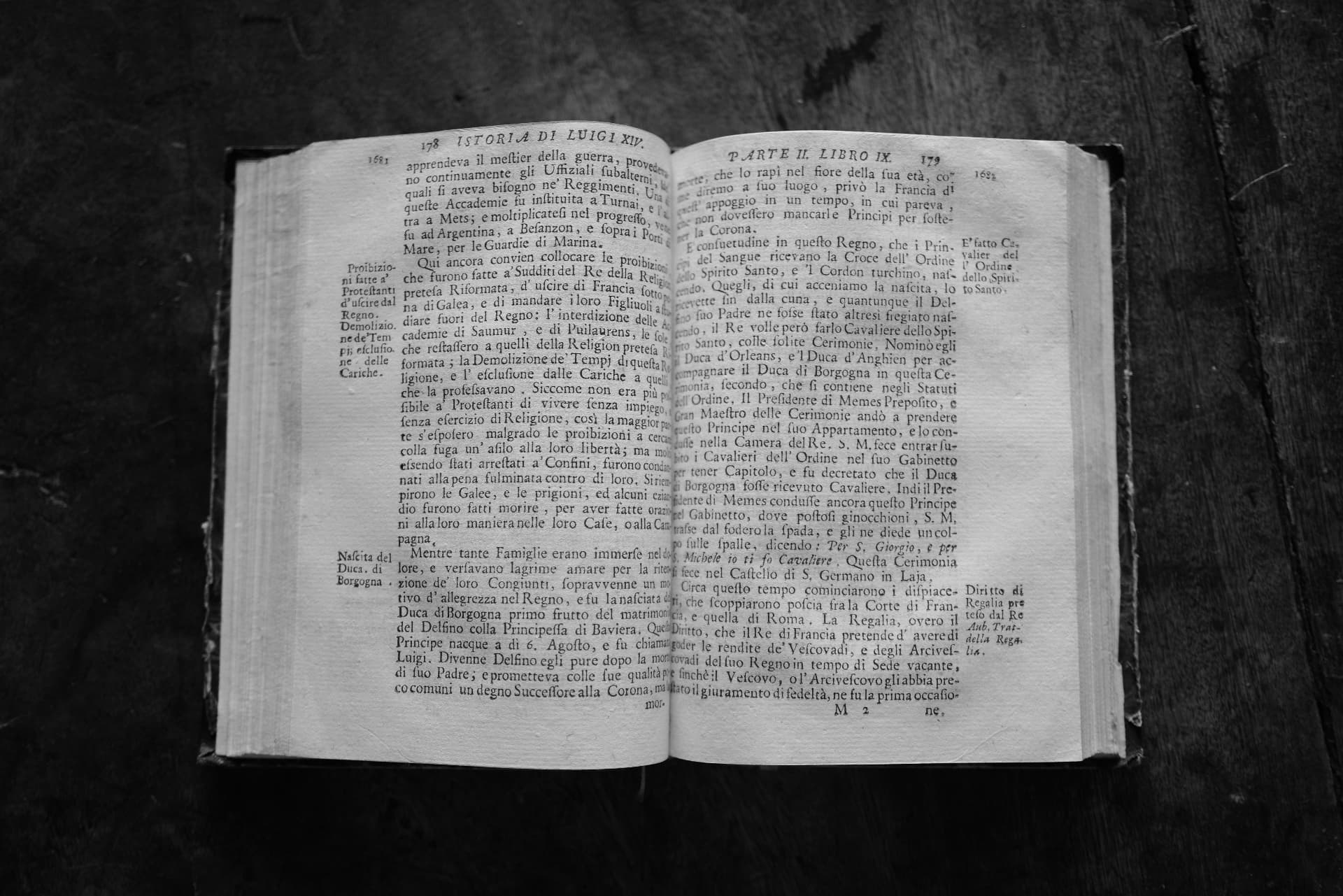
Before the modernists, a page like this was also a grid. It is from a 1720 Italian history of Louis XIV, and it holds four kinds of information at once: two columns of set type, a running head across the top, page numbers on the outside corners, and topic labels running down the outside margin: Proibizioni fatte a' Protestanti. Nascita del Duca di Borgogna. Diritto di Regalia. At the bottom of every page is a catchword, the first syllable of the next page. It should feel crowded and does not.
None of this was designed at a desk. The marginal glosses accumulated because scholars used history books by topic, not by narrative. The catchword accumulated because pages had to stay in order in the print shop. The two-column measure accumulated because a folio-sized line is too wide for the eye. The printer setting this page was continuing conventions that had been refined for two centuries since Gutenberg, and inherited from the scribal traditions before that.
Every element is a fossil of a use.
Around 1928, Jan Tschichold's Die Neue Typographie argued for something different. A grid should be designed before content, on rational principles. By the 1950s the Swiss schools had made this a discipline. The grid became a designer's instrument, not a printer's inheritance.
Then screens. Digital grids answered to a different constraint: the reader was using a device the designer had never seen. Bootstrap and its successors made the modernist grid installable in ten lines of markup. The relationship between grid and content, which had been fixed at print time, became something a reader's device could change.
Reading habits are now observed at a scale that would have astonished a printer in 1720. What might change next is how quickly the grid can absorb what has been noticed.
Across three centuries, what the grid is doing has stayed roughly the same. It is where graphic design and user observation meet.